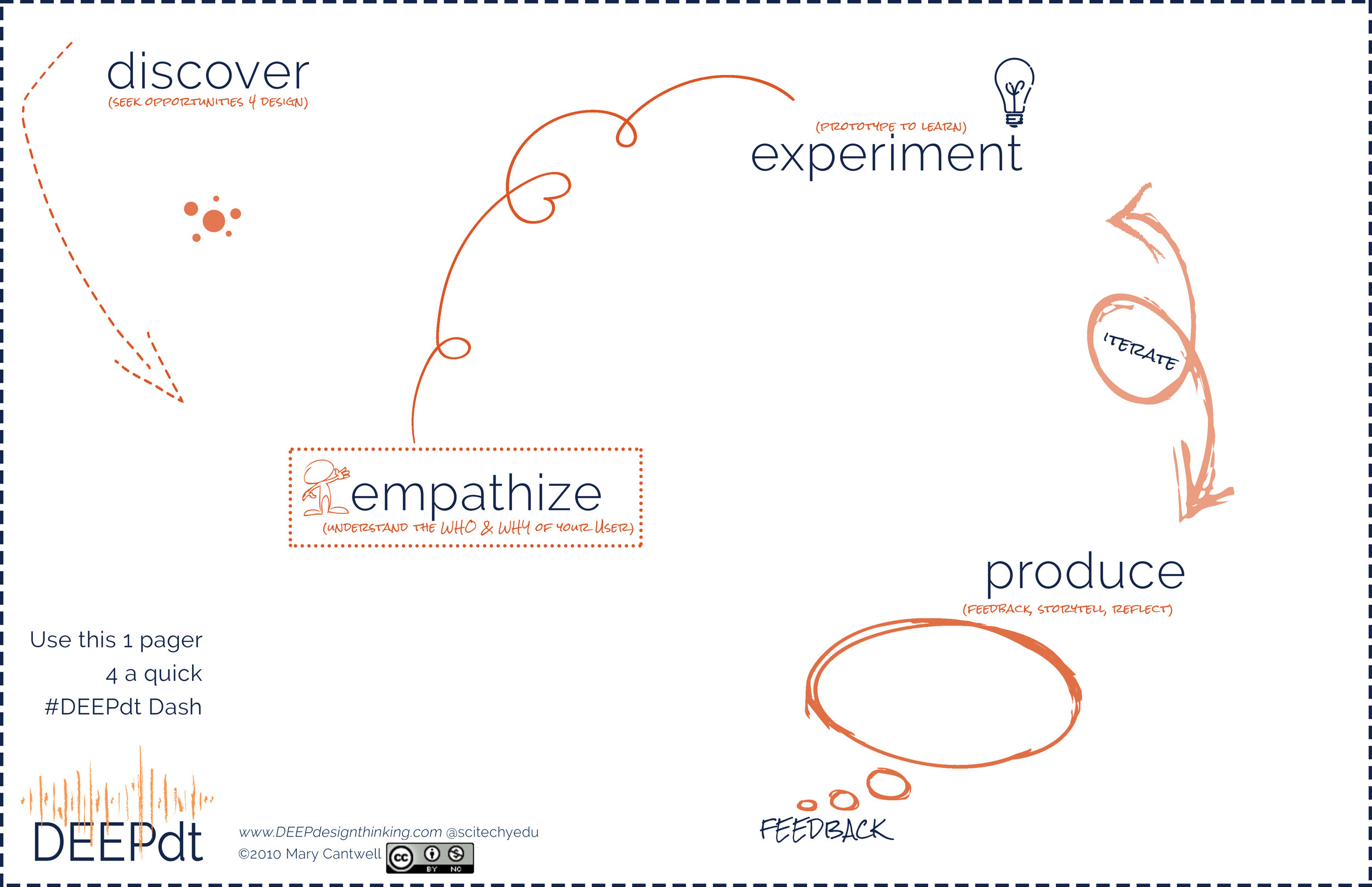
1 Pager #DEEPdt Dash
There are many ways to approach & apply Design Thinking. The key is the driving force: Empathy + People. I wrote a blog posts around the idea that "time" is a constraint that teachers battle every day especially when it comes to implementing design thinking inside the classroom. I have 3 buckets I typically view the origins of design thinking challenges (see below): I believe the classification of design thinking challenges stem from intention, framing, constraints (i.e. time, time, Administrator requirements, opportuinites), & mindsets.
DT Challenges, DT Sprints, DT Rapid-Cycles, DT Dashes (see below) are ways in which I classify the actual dt approach at hand.
In a later visual I will try to briefly explain the differences to these dt approaches. For now, let me briefly share what I like to call a DEEPdt Dash. A DEEPdt Dash is simply a very rough and dashy way to run through a design thinking challenge where a problem/need has been identified and designers are pushed by time for bias towards action and results. The Dash can be worked through on a large wall display or simply a 1 page handout. The idea behind the dash is to give individual/partner designers a fixed time constraint of 5 to 20 mins. to run through all the modes of DEEPdt all the while designing for the User (not self). A teacher or facilitator or team member can throw out a design topic or suggested need of a User and set the timer to launch the Dash. An image, a quick video clip, a story, a passage, a newspaper article etc are great tools to use to prompt and launch the Dash.
Below is my Version 1.0. As always its a work in progress prototype with hopes to test and gather feedback in time. For me just looking at it I know exactly what to do with it. Yet, I don't believe that will be the case for everyone. I believe this 1 pager will need a facilitation guide (like most of my materials that are still waiting). Stay tuned...
