A Quick Something.... Learning Spaces
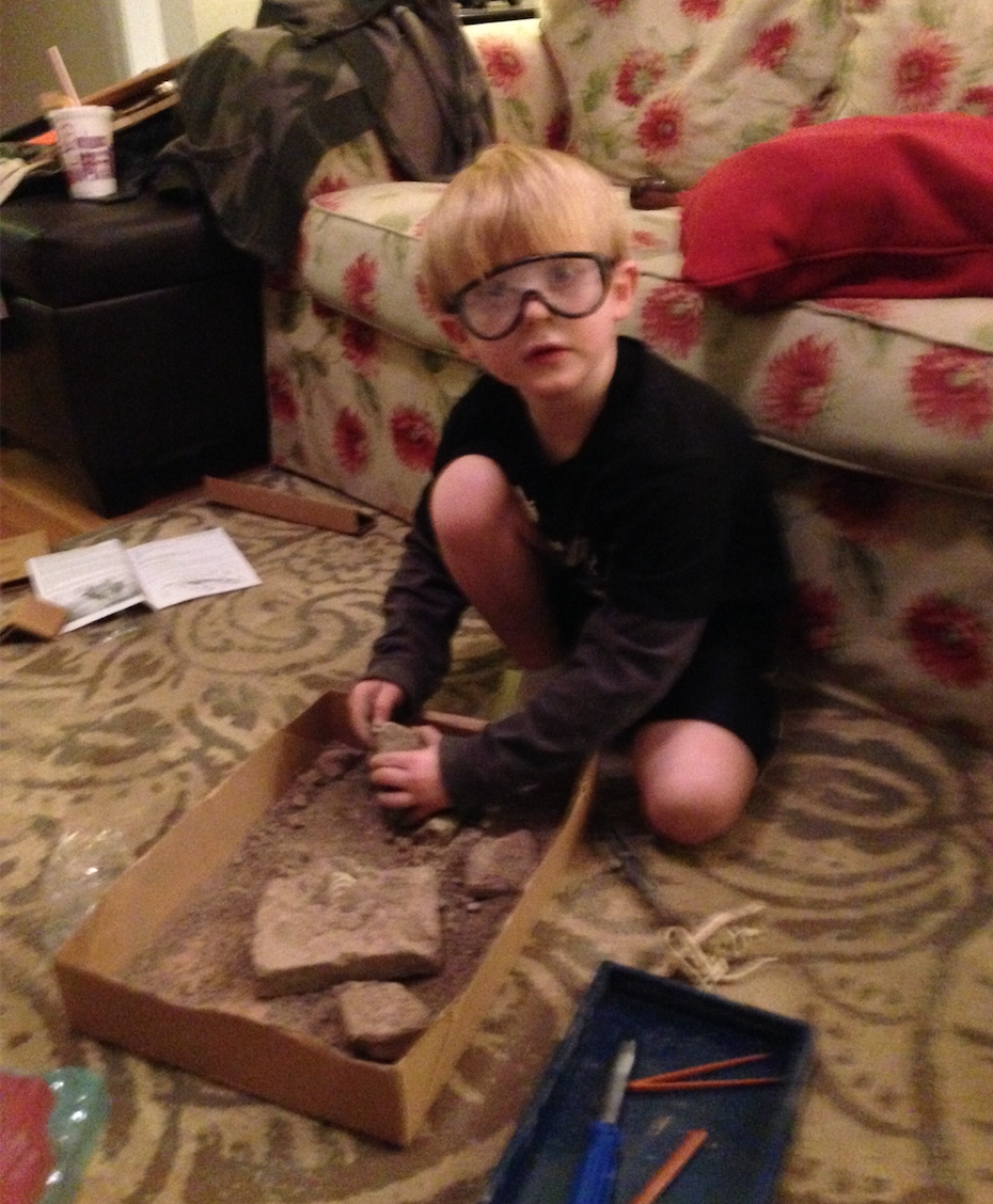
I love seeing new learning spaces... I love open floor plans and furniture especially designed for my feet. I love large sheets of butcher paper, colorful SHARPIES, and a never ending supply of Post-its. I also love large work surfaces and bouncy, wheely-chairs. If you were to design a learning space for me I would love all the above yet to be perfectly honest a comfy couch with seating for my feet (or a bed) is really all I need...Leave the rest of the space as space to be turned into whatever it needs to be turned in as the day progresses.
As I scroll through my twitter feed, I come across so many great spaces for "learning." Yet, I have to wonder... were these spaces truly designed for students (YOUNG & Teenagery) or really for the adults running the buildings with their eye on the front door waiting for visitors & cameras? Where can you see kids in these new designs & spaces besides sitting on the hard, flat surfaces?
Why is warmth, softness, and round edges no longer the NORM of learning spaces? Or maybe they never were and to me that is the problem. I am a 1980-1990s school kid with green walls, chair, brown desk, laminate tile, long hall ways, cool surroundings, 2-3 window classrooms, teacher desk at front, desks in rows, 45-50 min periods, textbooks galore, Art & PE once a week, etc Maybe the warmth, softness, and round edges were experienced OUTSIDE of school... and by the looks of the the NEW school designs, that stands today as well...
There is so much more I could wonder and O'pine about on this topic but for now... It would be awesome if learning spaces were designed through an "authentic" design thinking approach and the needs of the students mattered all the way to when the $$ is solicited for, plans are drawn up, furniture is purchased, & the doors opened for the cameras to snap their photos...
